Solyndra’s S-1
Solyndra’s IPO is providing tons of good fodder for gossip these days. For those unfamiliar: this is a high-flying CA solar startup that is making a novel-designed solar module (cylindrical), and which has raised hundreds of millions of dollars from private investors (plus the DOE loan guarantee program). The S-1 filings, both the original S-1 and amended S-1, have been covered extensively by the industry media.
The consensus thinking is that Solyndra is too expensive and too capital intensive. In fact, they received a going concern warning from their auditors. This is largely correct. But I’ve been doing some digging of my own, and have a couple more findings.
Margins are improving
The amended S-1 included a quarterly P&L that wasn’t available in the original S-1. And at the quarterly level, the margin story looks much better. The gross margin was only negative (29%) last quarter:

SOLY Quarterly Sales and Margins
In fact, positive gross margins are even visible on the horizon. Chart the quarterly numbers, and you can see the trend.

SOLY Margin vs. Revenue
If you extrapolate the revenues/cost trend from Q3 to Q4 (adding $5.2MM in sales, and only adding $1.7MM in cost), they will reach breakeven at quarterly revenue of about $60MM. Extrapolation is always tenuous (particularly when the curve above doesn’t look linear), but the bottom line is that Solyndra is much closer to positive gross margins than the chatter would have you believe.
Management got hit?
It appears that the management team has taken a big equity hit – a 43% drop, to be exact. Take a look:

SOLY Cap Table (Original vs. Amended S-1)
Follow these links for the exact pages on the Original S-1 and the Amended S-1
Reading the fine print, it sounds like many of their options might have expired out of the water? For example, Gronet’s original S-1 footnote says: “Includes 10,000,000 shares issuable upon the exercise of options exercisable within 60 days of October 3, 2009, none of which will be vested.”
So since the options weren’t vested, then the shares went away? Hard to tell with all the legalese – any lawyers out there want to help me out? But regardless of the cause, the bottom line is that the management team’s share of the company has fallen to 5.5%, from 9.4%.
Aligning PV with Application
So far I’ve shown a basic iso-IRR curve (in the earlier post “Low-efficiency penalty”) to get a sense for the penalty that low-efficiency modules have to pay. (The quick overview: this is a way of showing the tradeoff between efficiency and price, for the developer. Solar modules on the curve would provide the same financial returns for the project. Lower-efficient panels require more racking and labor, so they have to lower their price to be equally competitive.)

However, not all applications are the same. Specifically, it is a commonly-accepted claim that crystalline silicon is better suited to residential installations, while thin-film products are better for larger projects. I am going to prove that quantitatively, using the IRR curves.
The initial assumptions I used (for the curve above) were closer to a ground-mounted, utility-scale project. Smaller, residential projects have different economics. Specifically, they have higher fixed costs (the trouble of getting an installation team on the roof is larger, proportionally, than having a team show up at an open-field site). Also, the labor and racking costs are higher (higher-skilled labor, and more expensive racking to protect the roof). By changing these assumptions, we can see how it changes the shape of the curve. See below*:
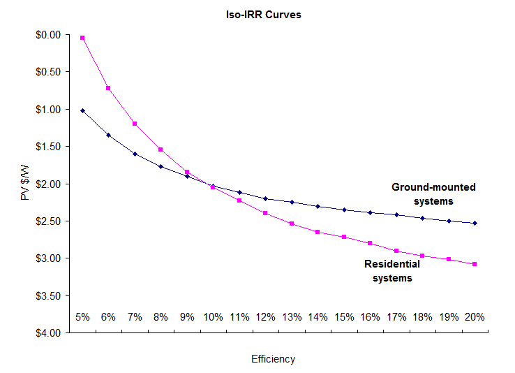
The constraints of the residential system make it less forgiving to the lower-efficiency modules. One way to look at it: in my previous ground-mounted example, a 10% module paid a penalty of $0.30/watt versus a 15% module. In a residential equivalent, the penalty grows to $0.67. In other words, residential projects are more willing to pay for higher efficiency, as a way of minimizing the more expensive labor/racking, and covering the larger fixed costs.
So, ground-mounted systems value cheaper price over good efficiency, and residential systems are more willing to pay more for high efficiency.
As a final step, let’s overlay the market prices of current technologies. Again, a big caveat: all of these numbers are very rough, and prices will always change quickly. These are just directional values.
| Technology | Efficiency | Cost ($/watt) |
| Amorphous silicon | 7% | $1.50 |
| Cadmium telluride | 10% | $1.75 |
| Poly-crystalline | 15% | $2.50 |
| Mono-crystalline | 18% | $3.25 |
Plotting these values on our graph, you can see the cost-performance horizon:
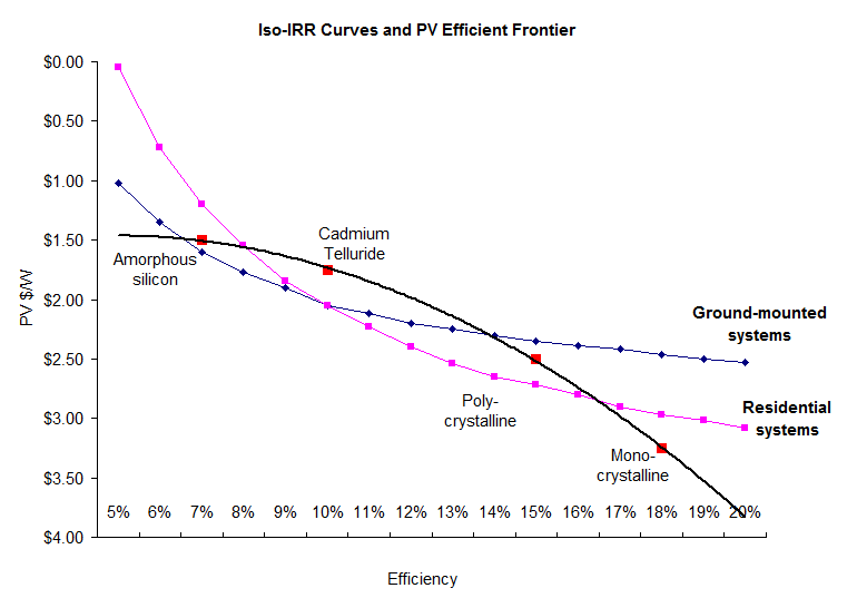 Theoretically, customers are always looking for something that is up and to the right on this graph (high efficiency and low cost). A ground-mount (large scale) customer is looking to optimize a curve that is shaped like the blue graph – and so you can see they will be more interested in using thin-film technologies. On the other hand, a residential customer, optimizing the pink curve, will be more interested in going with crystalline.
Finally: I’ve posted this model (you should see it on the box.net sidebar, “PV IRR Model II”). Feel free to download and play with it. Let me know what you think.
Note on the precision of the numbers*: The numbers here are only for directional takeaways. I have not gotten exact quotes on anything, and I am dramatically simplifying the cost model. I am accounting for only six line items (the largest ones), while a real system will have hundreds of components. Also, the fact that the curves cross at 10% efficiency is not relevant. 10% is not a magical number – in fact as I was fine-tuning the assumptions, I tried to keep the 10% efficiency & $2.05 point at the same IRR. But the real takeaway is that these curves will cross somewhere, wherever that point is.
Disaggregation: Silicon’s Advantage
Clayton Christensen, an HBS professor, has a good framework (in The Innovator’s Solution) for thinking about a company’s scope. I’ll give an over-simplified summary of the concept:
In the early days, markets are integrated: The easiest way to solve a new problem is to provide a completely integrated solution. For example, in the early days of the PC industry, the best solutions were provided by companies such as Apple and Silicon Graphics, where they could optimize the software, the hardware, and the market delivery all at once.
As they mature, markets tend to dis-aggregate: As the market matures, tends to dis-aggregate, which allows best-in-class in each category. So Intel can focus on producing good microprocessors, Microsoft can focus on the operating system, and Dell can focus on the assembly & delivery of the PC. All in all, this leads to a better product. By being able to select the best-in-class from each market segment, a customer gets the best possible product.

Clayton Christiansen’s evolution of the PC industry, 1978 – 1990
Source: The Innovator’s Solution, Clayton Christensen & Michael Raynor. Harvard Business School Publishing, 2003
The framework can be useful to look at solar technologies. In particular, let’s contrast the thin film value chain with the silicon value chain.
Thin film: integrated
I’ll use First Solar as the prototype for this segment. (They are being chased by a bunch of startups, but nobody else is manufacturing in the same scale.) They take in a bunch of raw materials: glass, cadmium telluride, and electrical components… and ship out a completed module. Their value chain looks more like Apple’s integrated PC model: they are a single manufacturer responsible for high efficiency, mechanical integrity, and manufacturing uniformity.

Thin Film Value Chain
Silicon: disaggregated
The silicon value chain is quite different. There are four discrete pieces of the value chain: silicon is refined into an ingot, then cut into a wafer, then wafers are cut up and scribed to create cells (the step that makes the material photo-active), and then assembled into modules. Each of these products has a market where they can be bought and sold.
Silicon Value Chain
Implications for market competition
Perhaps some of First Solar’s success comes from their close coordination?
Certainly, much of the cost advantage that First Solar enjoys comes from the fact that its semiconductor is thin (and therefore cheap). The bandgap of CdTe is tuned better to the wavelength of the sun’s light. However, their labor content and materials handling costs are also very low, which can only be achieved with the close coordination of manufacturing. Also, by depositing the entire semiconductor stack at once (CdTe, CdS, and the front & back electrodes), First Solar can optimize and minimize the design & materials used.
Silicon might benefit in the longer term from integrating best-in-class technologies across the value chain
Silicon’s value chain should be a long-term strength. Startups can focus on innovating within specific segments of the value chain. They don’t have to integrate vertically in order to produce & ship a product. Therefore, then, the customer will be able to assemble the best-in-class from each market segment, in order to optimize the cost & performance of silicon. A couple examples:
- 6N Silicon is developing technology with uses metallurgical-grade silicon handling for ingot production. Their approach isn’t as pure as the current methods, but the costs fall much faster than the performance does.
- 1366 Technologies is developing technologies to make the cell more efficient: thinner front contacts, a more absorptive front side of the cell, and a more reflective back side.
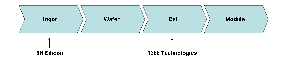
Both of these startups are focused on different parts of the silicon value chain (ingot and cell, respectively), and so they are not actually competing with each other. Perhaps they might both be part of the winning technology assortment.
So even though First Solar has a huge cost advantage right now, don’t count crystalline silicon out just yet. The market structure is in their favor.
The Low-Efficiency Penalty
“Dollar per watt” can be a misleading number. For those who aren’t familiar, if you sell a 150-watt module for $300, that’s $2/watt. Pretty simple.
However, even though it’s a common way to talk about pricing, it leaves a lot out of the equation. In particular, it doesn’t factor in the efficiency of the module. Lower-efficient modules require more space for the same amount of power output. That means more racking to hold them up, more labor to install them, and more land. I’ve heard people talk about a “penalty” for low efficiency, so I wanted to calculate what that would look like.
I put together a very simple model of a PV system. The PV modules, inverter, and wiring are all defined on a $/watt basis, while the racking and labor are defined on a price per square meter of solar modules. So, with lower efficiency modules, you need more of them – and the model grosses up the racking and labor in proportion.
Let’s work through a quick example. With the assumptions above, a developer would earn a 10% return if he installed 1MW of 15% efficient modules while paying $2.35/watt for the modules. On the other hand, he would also earn a 10% return if he installed 1MW of 10% efficient modules, paying $2.05/watt. In other words, he needs a $0.30/watt discount for the 10% efficient panels, because he needs to use that money to buy the extra racking and pay for the extra labor.
You can plot these points on a curve. Below, I show all the points at which a developer is indifferent, for efficiencies ranging from 5% to 20%. (Note that I flipped the price axis, so that the numbers get smaller as you go up. The consulting rule of thumb is that “good” is always up and to the right, and in this case, “good” is cheap.) The two points in my example above are shown as the red and purple boxes.
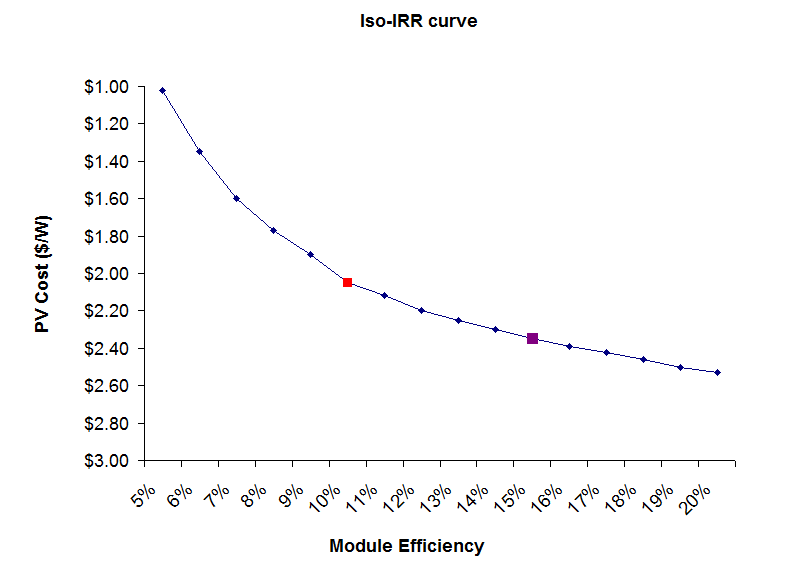 The interesting here is that the curve gets steeper the further to the left you go. The difference between 20% and 15% efficiency is only $0.16/watt. Between 15% and 10% it’s $0.35/watt. Between 10% and 5%, the difference is a full $1.00/watt.
This is a big reason why so many people are pessimistic on amorphous silicon. With expected efficiency of only around 5-7%, they start with a $0.75 to $1.33 penalty versus a silicon panel that gets 15% efficiency.

2 comments