Five solar debates: will a-Si and Concentrating PV survive?
[PS: sorry for the silence the last couple weeks. Prep for Intersolar was pretty intense. Great show, though.]
Radical solutions to the efficient frontier
I’m a big fan of the efficient frontier framework in solar: in general, you can get better performance, but you have to pay more. And while everyone wants to break away from the pack, most people who claim to be way off from the efficient frontier are lying to themselves.
There are two technologies that have taken new approaches to the efficient frontier: amorphous silicon (low cost, low efficiency), and concentrating PV (high efficiency, but higher system cost). Neither approach is guaranteed to pay off. I’ll break down the outlook on both.

Efficient Frontier in Solar PV
Amorphous Silicon
Life…
The amorphous silicon market is dominated by two tool major manufacturers, Applied Materials and Oerlikon. They have, collectively, nearly a dozen clients, including ENN, Signet Solar, Sunfilm and Moser Baer.
There are also a number of large companies with amorphous products as part of their portfolio, such as Sharp, DuPont, and Q-Cells/Sontor. Sharp’s business seems to be thriving. Even Qualcomm is getting into the mix.
Seems like a nice list of blue-chip clientele.
…Or Death?
However, the technology already has a few black eyes. Sunfilm filed for bankruptcy, and eventually merged with Sontor. Applied Materials is rumored to be scaling back their business, and considering abandoning it. This is led some people to question whether this technology will even become obsolete. Part of the problem is that amorphous’ low efficiency forces them to pay a penalty, as I explain here.
Concentrating Solar (PV)
Concentrating PV is also controversial. They start with high-efficiency semiconductors (efficiency of nearly 40%) which are very expensive. Since the material is expensive, they shrink it reduce the cost, and use lenses to concentrate the light that it sees. Most concentration factors range from 10x to 500x – meaning that you use 10x to 500x less material, and that material would see 10 to 500 times the regular intensity of the sun.
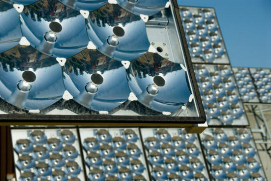
However, the decision to use concentrators creates other system requirements. The optical systems require the lens to be pointed at the sun (in other words, dual-axis trackers are required). These are expensive. Also, that much concentration generates a ton of heat – so these systems typically incorporate a cooling system. Again, more cost.
Life…
The sector has a number of well-funded, talented startups, including SolFocus, GreenVolts, Solar Junction, Solaria and Soliant. Amonix just closed a 126MM round from Kleiner Perkins and Goldman Sachs – smart money, a very good sign for the sector.
…or Death?
On the other hand, the market has over-promised and under-delivered for years. There are still big detractors, and I’ve heard someone within the industry say that if they don’t put up big numbers in 2010, they never will. Finally, there are a lot of questions about the long-term maintenance requirements of the systems, and these questions won’t be answered conclusively for years.
My call
I think both of these technologies have legs, particularly in specific applications. Amorphous can thrive in large applications where the economics are in their favor, while concentrators are great in areas with a lot of direct sun. But the jury is out on whether these will remain niche technologies or serious players.
What do you all think? Either way, we can follow the news below (and keep checking back for updated stories/links):
Recent amorphous news
7/21/10: What timing! AMAT will no longer sell SunFab
7/15/10: Oerlikon boasts of new customers and higher efficiencies
7/14/10: Sharp claims a-Si will constitute half of their business
6/9/10: Signet Solar appears to be insolvent
5/19/10: Reports that AMAT will redesign their Sunfab, and potentially abandon the business
4/2/10: Bankruptcy for Sunfilm/Sontor
2/4/10: Nice in-depth analysis of the a-Si market
Recent CPV news
7/13/10: Concentrix announces plans for 1MW site in NM, and SolFocus claims LCOE of $0.085
4/21/10: Amonix raises 130MM from Kleiner, Goldman Sachs
6/18/09: Greenvolts coverage, with some criticism of the sector
Innovalight Case Study
(A quick interruption of the solar debates series – I’ll return to it with the next post. But I wanted to comment on some breaking news.)
Innovalight and JA Solar have recently announced a partnership that shows a real-time example of my silicon disaggregation thesis.
A quick background: Innovalight is a startup that is developing a quantum dot ink. Quantum dots are basically nano-sized particles that capture a very specific wavelength of light, depending on their size. So these inks can be tuned (simply by controlling their size) to capture extra light beyond the spectrum that a normal solar cell collects. It’s like a little booster layer that captures more light.
 Pretty sexy science. But what I like even more is that they can deposit their ink using standard printing tools, and integrate this into existing production lines. (And if, as they claim, it only requires a single step, this implies that there are no other chemical, thermal, or drying steps required.) So Innovalight doesn’t have to be in the cell manufacturing business. That’s where JA Solar (a top-5 Chinese solar cell manufacturer) comes in.
From JA Solar’s point of view, this ink can be a huge win. If, as the article claims, they can transform a 30MW line to a 35MW line, this represents a 14% reduction in cost, both for their cost of goods (because the same physical module produces more power), and for their CAPEX/watt (because the same production line can be amortized over more power produced). Of course, this is before factoring in the cost of the ink and printing equipment – and there are likely other technical challenges that I won’t get into here.
But most important, in my opinion, is what this signals for the silicon value chain. Inks could represent one more piece of the market. There will be competition – perhaps Innovalight will remain dominant, but maybe not. But either way, silicon modules can assemble the best in class from each of these sub-markets – wafers, cells, inks, etc – and that is good for getting costs down and performance up.
And this competition is something that the monolithically-integrated thin-film players don’t get to benefit from.
Five Solar Debates: the Thin-film Race
These are exciting times for the solar industry. There has been a ton of innovation, a ton of investment, and it’s finally time to see who can make good on their promises. But many of the best competitions require an insider’s understanding of the industry. I’m going to try to change that.
This is the beginning of a five-post series where I will frame some of the key battles that are playing out right now in the solar industry. Almost like a scouting report for a football game. And the first topic is:
The Thin-film Horse Race: Who will emerge first to challenge First Solar?
The debate
Thin-film solar modules are dramatically cheaper than silicon modules. You only need to look at First Solar’s numbers (costs under $0.90/watt) to see the proof. However, they are challenging to manufacture. There have been six thin-film startups (see table below) that have raised over $100MM in venture funding, assembled world-class management teams, and still have not yet been able to ramp up their manufacturing facilities. But they are close. So the question is: which company will figure it out first?
This is actually a battle of manufacturing technologies:
| Company | Manufacturing Technology | Investors |
|
|
Thermal Sublimation | Doll Capital Management, Technology Partners, GLG Partners, The Invus Group |
|
|
Field-Assisted Simultaneous Synthesis and Transfer (basically, evaporating two films, and then sandwiching them together) | NEA, Morgan Stanley, Noventi Ventures, Paladin Capital Group, Yellowstone Capital, Sequel Venture Partners |
|
|
Sputtering | Kleiner Perkins, Firelake Capital, Vantage Point, Atel Ventures, Bessemer, Leaf Clean Energy, Atlas Venture, Garage Technology Ventures, Passport Capital |
|
|
Ink Deposition | Mohr Davidow, Firelake Capital, Capricorn, U.S. Venture Partners, Benchmark Capital, Riverstone Holdings, The Carlyle Group |
|
|
Electroplating | Crosslink Capital, Hudson Clean Energy, Musea Ventures, Firsthand Capital, Convexa Capital |
|
|
Ink Deposition | RockPort Capital, CMEA, U.S. Venture Partners, Virgin Green Fund, Argonaut Private Equity, Redpoint Ventures |


What will determine the winners?
The key to winning this race is all about “manufacturability”: the ability to deposit a very thin semiconductor with complete uniformity, and then repeat that a million times, so that the millionth looks just like the first. This is way harder than it seems: materials build up on the equipment, small errors compound into big ones, and things that should be repeatable are never that easy.
Also, there is a big difference between having the capacity and having a running production line. It only takes money to buy the equipment, but it takes a lot of good engineering to get it running well.
So ultimately, these companies are constrained by their ability to manufacture, more than their customers’ willingness to buy their products.
Success is subjective, but I define it as manufacturing at a 100 megawatt-per-year run rate. In comparison, First Solar recently crossed the 1 gigawatt (1,000 megawatts) capacity mark.
My opinion
This is a common debate among solar followers, and nobody know who will emerge first. I think Miasole and Abound are at the head of the class, and closest to scaling to 100MW and beyond. [Note: I used to work at Abound, so I may be biased.] This is a slight underdog pick, as Solyndra and Nanosolar have more money and higher profiles. Think of it as the NY Yankees (Solyndra) versus the Tampa Bay Devil Rays (Miasole & Abound): they are close, in spite of having a smaller budget. Ultimately, time will tell who wins.
In the meantime, I’ll keep posting news stories below so we can all watch as these companies scale up. Check back from time to time, as I’ll keep posting relevant news.
News:
Miasole: 22MW expected shipments in 2010, 6/10/2010
Abound Solar: 24-30MW run rate, off a line with 65MW capacity, 5/21/2010
Miasole: fab (at full uptime) has capacity of 75MW, 5/12/2010
Nanosolar: 640MW capacity in Germany (but no claims of running the line), 3/22/2010
SoloPower: working on a 60MW fab, which will be producing in 2011, 2/18/2010
HelioVolt: fab will have 20MW capacity (no guidance on timing, though), 1/7/2009
Iso-IRR pt 3: Sunlight
The Iso-IRR curve seems to be a popular way to think about different solar plants. So I wanted to use it to look at how much sun matters.
Turns out it matters a lot. As a location’s sunlight goes up, so does a developer’s willingness to pay for it. That’s not a big surprise. What I do find surprising is the overall magnitude of the impact. A developer in Phoenix would be willing to build a solar plant for roughly $1.75 more per watt (with the same return) than an identical system in Chicago – a 57% premium.
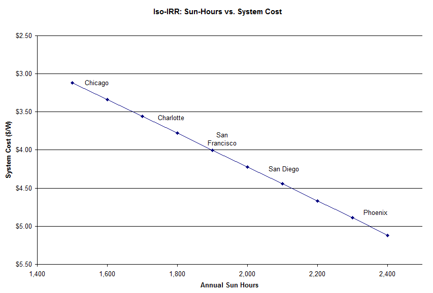
This is why people expect the most promising American solar development to take place in the sunny southwest. And reinforces how impressive Germany’s support of the industry has been (their sunlight resembles Chicago’s).
Final technical notes:
The model behind this is the same LCOE model that I posted a couple weeks ago (I used model #3). Keep in mind that, as always, the exact numbers are not precise, use this only directionally.
Also, the sun-hour per city data comes from NREL. For now, I have been using full-tilt sun data (with the module tilt equal to the location’s latitude), but in future posts I’ll look at how this changes with lower tilt.
Burdened LCOE
Renewable energy isn’t yet competitive with the grid. That’s no surprise. However, it’s an unfair fight. And I’m not talking about carbon pricing (which would be nice). I’m talking about the fact that renewables will deliver energy, with zero fuel costs, for 20-25 years, while they are being compared against today’s spot price for electricity. And while electricity prices may change, the energy out of a solar project is locked in as soon as you build it. In other words, renewable energy plants provide a hedge against future energy price changes.
And electricity prices have a good chance to increase in the future. Historically, they have grown by about 2% per year, but many smart people think they will grow at faster rates going forward.
That benefit is hard to bake into today’s current LCOE calculations. But if the price of electricity is rising, then the true comparison for a renewable source is not today’s price, but the average electricity price over the next 25 years.
I’ve created a metric called “Burdened LCOE”. For this, I’m simply starting with today’s energy rates, and then growing them over 25 years, at different growth rates. The 25-year average is the burdened LCOE.

Burdened LCOE, as function of growth rate
The impact is significant. A customer paying $0.15/kWh today would actually have a burdened 25-year LCOE (with 4% annual price growth) of $0.25/kWh. In other words, someone would be just as well-off by buying a solar system with a $0.25 LCOE as they are if they pay $0.15 today, expecting prices to go up by 4% per year. Someone paying $0.12 today would expect to pay an average of $0.20 over the same horizon. Seen through this lens, renewables are much more competitive with fossil fuels.
So this begs the question: will electricity price increases actually accelerate? I don’t know. But many of the smartest people are betting on this. Some reasons to be bullish on electricity prices:
- Natural gas prices may increase. We have a lot of supply, but limited refining capacity and port capacity for importing LNG. That’s the extent of my knowledge – for people who know what they are talking about, surf over to The Oil Drum.
- Coal plants are not being built. Activism and NIMBYism are preventing nearly all new coal plants from being built. See Earth2Tech’s coal death map. So supply of electricity cannot keep up with demand. Prices rise.
- Maintenance costs will likely go up. This is related to the fact that no new plants are built – therefore, old plants have to be kept running beyond their planned lifetimes. Maintenance costs begin to escalate.
Look, I’m not trying to convince you to buy electricity futures. But I am trying to get you to cut renewables some slack when comparing a 25-year generation asset against an electricity spot price that may go up tomorrow.
Demystifying LCOE
(Quick caveat: this article is meant for beginners who are unfamiliar with LCOE. To those in the industry, this will be too basic. I’ll have another post for insiders soon – a new metric I call “Burdened LCOE”.)
Levelized Cost of Electricity (LCOE) is a valuable metric. LCOE allocates the costs of an energy plant across its useful life, to give an effective price per each unit of energy (kWh). In other words, it’s like averaging the up-front costs across production over a long period of time.The nice thing about LCOE is that it gives a single metric that can be used to compare different types of systems – from renewable projects, where the up-front capital cost is high and the ‘fuel’ cost is near zero, to a natural gas plant, where the capital cost is lower, but the fuel cost is higher. And it can even be compared against the price you pay on your utility bill ($/kWh).
However, LCOE is also feared – mainly because it can be complex. I’m going to try to change that here.
Instead of just giving a single overview of an LCOE model, I’m going to show a few different levels of detail, so you can matches the level of model complexity with what you’re trying to accomplish. You can follow along by downloading the model “Simple LCOE x3” from the box.net sidebar.
Level 1: Back of the Envelope: This is minimum amount of analysis needed to get to a number that even looks like an LCOE. You only need four numbers:
- System size: This is often referred to as the ‘nameplate capacity’ of the system. Specifically, it is a measure of how much power the system could produce when running at full strength.
- System cost: The cost to install the system – most often given on a per-watt basis. For example, if you get a quote for someone to build a 10kW (10,000 watts) nameplate system for $40,000, that is a cost of $4/watt.
- Watt-hours per watt-peak: The nameplate power is only half of the story: you then need to know how much energy you get out (power delivered over a period of time). So this number measures how many hours per year the system is operational – in other words, how many hours of sun does a system receive.
- Productive years: Since the production happens over time, it’s critical to understand how many years the system will work. Most components are warranted for 20-25 years.
Level 2 – If you want to include all assumptions that are significant, you need three more:
- Nameplate de-rating: Even if a system is supposed to produce 10,000W, it rarely produces that. There are a lot of steps in processing the power (efficiency losses in the inverter, wire, and other operation), and they eat up about 20% of the power between the module and the grid.
- Discount rate: future value is discounted against today’s. Otherwise, you could invest your money today, get a return, and then invest a larger amount tomorrow. For the purposes of an LCOE, I discount future production – which accomplishes the same goal.
- Incentives: whether we like it or not, government incentives matter. At the federal level, there is a 30% tax credit (refunds 30% of the system cost). There are also dozens of state and municipal incentives (the best summary is www.dsireusa.org).
Level 3 – Three more variables will make you sound more credible when talking to people in the industry:
- Degradation: Systems degrade over time – and this includes the PV modules themselves. Most assume that degradation is between 0.5% and 1% per year. Note that most modules are warranted to perform up to 90% of their rated power for 10 years, and 80% of their rated power for 25 years – numbers that aren’t far off from 1% annual loss.
- Maintenance: Someone has to clean the modules and repair the broken units. This is often modeled as a percent of the initial cost (typically about 0.5%), recurring every year.
- Inverter replacement: Unfortunately, most inverters need to be replaced. While reliability is improving, most people assume that the inverter will have to be replaced at about year 10.
In the box.net sidebar, I’ve uploaded a model (“Simple LCOE x3.xls”) that has all three of these models. Feel free to download and use freely.
Also, if you want to learn more about each of the assumptions, here is a summary of typical ranges, with further reading where possible:
| Metric | Low value | Average value | High value | Further information |
| System Cost ($/watt) | Residential: $5.00
Commercial: $4.00 Utility-scale: $3.00 |
Residential: $6.00
Commercial: $5.00 Utility-scale: $4.00 |
Residential: $7.00
Commercial: $6.00 Utility-scale: $4.50 |
|
| Watt-hours per watt-peak | 1,400-1,600 | 1,700 – 1,900 | 2,000-2,200 | http://rredc.nrel.gov/solar/old_data/nsrdb/redbook/ |
| Time horizon | NA | 20 years | 25 years | |
| De-rating | 77% | 80-82% | 85% | PVWatts model from NREL: http://rredc.nrel.gov/solar/calculators/PVWATTS/version1/derate.cgi |
| Discount rate | 7-8% | 9-12% | 13-15% | Ask a banker |
| Incentives | 30% Federal Tax Credit | DSIRE (Database of State Incentives for Renewable Energy): http://www.dsireusa.org/ | ||
| Degradation | 0.25% | 0.5% | 0.75% | |
| Maintenance | 0.25% | 0.5% | 0.75% | |
| Inverter replacement year | 7 | 10 | 15 | |
| Inverter replacement cost ($/watt) | $0.30 | $0.35-$0.45 | $0.55 |
Finally, keep in mind that the variables above still leave out a ton of complexity. The system cost depends on hundreds of design decisions; the solar module’s production depends on its tilt angle and temperature (among other things). But if you’re starting from scratch, this is a good place to start.
Update, June 6: I’ve fixed a bug in the LCOE model. (I wasn’t discounting the inverter replacement in model #3.)
//
CIGS’ Complexity Paradox
Thin-film solar research is largely a two-party system. Its two dominant ideologies are cadmium telluride (CdTe) and copper indium gallium (di)selenide (CIGS), the two different semiconductors used as the active PV layer. And like politics, you can find people who argue the merit of each side – sometimes, beyond the point of reason.
Both technologies have loads of promise: module efficiencies upwards of 15+%, and costs of around $0.50/watt. But the similarities end there.
Supporters of CIGS point to its versatility (can be manufactured in dozens of ways, including methods at room temperature and room pressure), and its higher theoretical efficiency (its bandgap physics is better, plus the highest CIGS cell efficiency is 20.1%, while CdTe is 16.5%).
Supporters of CdTe point to its simplicity – the active layer requires just two components (CdS and CdTe), which are deposited right next to each other… while CIGS actually requires at least six components (C, I, G, S, plus Sodium, Sulfur, and CdS) in a much more complex configuration. Oh, and the CdTe camp has First Solar: the powerhouse with a multi-billion backlog, 1GW of production capacity, and gross margins north of 40%, even in a horrible solar market.
So if these technologies are both legit, then why the imbalance in venture capital funding:
| Thin-film startups that have raised $100MM+ in the last ~4 years: | |
| CIGS | Cadmium Telluride |
| Heliovolt | Abound Solar |
| Miasole | |
| Nanosolar | |
| SoloPower | |
| Solyndra | |
(You could also set the bar lower (e.g. startups to raise $20MM+), and the list would look similar (add Stion to the CIGS side). And I’ve heard anecdotally from VCs that the number of business plans that went unfunded had a similar bias toward CIGS.) So how did CIGS get so much more money, while CdTe has the only ‘victory’ (FSLR) to date?
One Theory
Recall the point I made above: CIGS is way more complex (six or more components), and it is way more versatile in how it can be deposited (ink deposition, electroplating, sputtering, chemical vapor deposition, etc). Now, put yourself in the shoes of a materials science PhD candidate at Stanford, or a researcher at NREL. Which semiconductor would you study? There are probably 10x more ‘interesting’ problems on the CIGS side. And in general, an interesting problem leads to an interesting solution, which leads to getting published.
Continuing this logical chain… CIGS gets more research, therefore more CIGS patents are filed. More companies are founded around CIGS, and more talented management teams are built around CIGS. Ultimately, this would lead to more VC money flowing to CIGS.
The Implication
The thing I find most interesting, if this is correct (with stress on the “if”): it illustrates a direct conflict between the academic research community and the venture capital community – groups which otherwise have a very symbiotic relationship. Academia is pulled toward complexity, because that presents more novel research topics. However, for commercialization, simplicity is likely to be more profitable than complexity.
This may be changing. The venture and research communities learn quickly, and all the companies above were funded circa 2005-2009. Sequoia’s more recent investment into SunPrint is a small signal of the increased focus on simplicity & manufacturability.
Final notes:
- Apologies to the amorphous silicon crowd for not including you in the ‘thin-film research’ category. But my focus here is on academic research and venture funding, where I haven’t seen a-Si being actively pursued with the same vigor.
- Anyone have any ideas for data I could find to test this hypothesis? Besides simply counting patents, is there any good way to track the papers published, by type of semiconductor?
- A request to those who are well-versed in fuel cells or electrochemical batteries – could this same phenomenon be playing out in those markets? Are complex technologies getting disproportionate funding?
Trackers are an endangered species
Trackers are becoming rare in most solar projects. The common wisdom, which just about anyone in the industry will say, is that dropping module prices make it difficult for trackers to compete. I decided to model this, to confirm quantitatively that it is true.
Fundamentally, trackers improve the performance of solar plants by keeping the solar modules aligned with the sun. At the highest level, there are two types of trackers: single-axis trackers (rows of modules pivoting along a bar), and dual-axis trackers, where a block of modules rotates in every direction. (See pictures of examples below.) In general, a single-axis tracker will increase a system’s energy production by about 25%, while a dual-axis tracker will increase production by about 35%.
Single-axis tracker
Dual-axis tracker
So why aren’t trackers used more often, if they can increase production? Again, this can be shown with a simple model. In this model, I am dramatically over-simplifying a solar system, to show only the installed cost per watt, versus the total energy production per watt. The only variable that I’m changing is the system cost – and then adding a tracking system.

Single-axis tracker model
A tracker changes the system in two ways: it adds a fixed cost (in $/watt), and increases production by a percentage. Given these assumptions, you can see that a dropping system cost makes trackers less attractive. What’s interesting is that the drop in ROI actually accelerates as systems get cheaper:

Tracker ROI
There is some intuition for this. Think of a tracker as a product which ‘extends’ the power production of a system. But when the system gets cheap enough, it becomes more cost-effective to simply extend the system by installing more solar modules and ditching the tracker.
Finally, I want to explain why SunPower is still using trackers today (correctly). First, they are more expensive, so they tend to be on the left side of the chart above. But they also have the highest power density – so the tracker is actually slightly cheaper on a $/watt basis. The same amount of tracking hardware moves more watts. (I chose not to model the power density in the exercise above, because it made the model much more complex, and therefore more difficult to explain.)
End Notes & Disclaimers:
All of the costs here (including system and tracker cost) are approximate. But again, the fundamental relationship (lower PV costs lead to lower tracker ROI) will be the same.
Also, a big omission here is the time value of money: I’m not discounting future production (since, of course, you pay for a system up front, while the production is later on). This will make the trackers look worse across the board. Like the module efficiency, the time value of money is something that adds a lot of complexity, but doesn’t change the point.
Finally, this entire discussion only applies to flat-plate solar modules. For concentrating solar PV, tracking is an absolute requirement at any cost.
Solyndra’s S-1
Solyndra’s IPO is providing tons of good fodder for gossip these days. For those unfamiliar: this is a high-flying CA solar startup that is making a novel-designed solar module (cylindrical), and which has raised hundreds of millions of dollars from private investors (plus the DOE loan guarantee program). The S-1 filings, both the original S-1 and amended S-1, have been covered extensively by the industry media.
The consensus thinking is that Solyndra is too expensive and too capital intensive. In fact, they received a going concern warning from their auditors. This is largely correct. But I’ve been doing some digging of my own, and have a couple more findings.
Margins are improving
The amended S-1 included a quarterly P&L that wasn’t available in the original S-1. And at the quarterly level, the margin story looks much better. The gross margin was only negative (29%) last quarter:

SOLY Quarterly Sales and Margins
In fact, positive gross margins are even visible on the horizon. Chart the quarterly numbers, and you can see the trend.

SOLY Margin vs. Revenue
If you extrapolate the revenues/cost trend from Q3 to Q4 (adding $5.2MM in sales, and only adding $1.7MM in cost), they will reach breakeven at quarterly revenue of about $60MM. Extrapolation is always tenuous (particularly when the curve above doesn’t look linear), but the bottom line is that Solyndra is much closer to positive gross margins than the chatter would have you believe.
Management got hit?
It appears that the management team has taken a big equity hit – a 43% drop, to be exact. Take a look:

SOLY Cap Table (Original vs. Amended S-1)
Follow these links for the exact pages on the Original S-1 and the Amended S-1
Reading the fine print, it sounds like many of their options might have expired out of the water? For example, Gronet’s original S-1 footnote says: “Includes 10,000,000 shares issuable upon the exercise of options exercisable within 60 days of October 3, 2009, none of which will be vested.”
So since the options weren’t vested, then the shares went away? Hard to tell with all the legalese – any lawyers out there want to help me out? But regardless of the cause, the bottom line is that the management team’s share of the company has fallen to 5.5%, from 9.4%.
Aligning PV with Application
So far I’ve shown a basic iso-IRR curve (in the earlier post “Low-efficiency penalty”) to get a sense for the penalty that low-efficiency modules have to pay. (The quick overview: this is a way of showing the tradeoff between efficiency and price, for the developer. Solar modules on the curve would provide the same financial returns for the project. Lower-efficient panels require more racking and labor, so they have to lower their price to be equally competitive.)

However, not all applications are the same. Specifically, it is a commonly-accepted claim that crystalline silicon is better suited to residential installations, while thin-film products are better for larger projects. I am going to prove that quantitatively, using the IRR curves.
The initial assumptions I used (for the curve above) were closer to a ground-mounted, utility-scale project. Smaller, residential projects have different economics. Specifically, they have higher fixed costs (the trouble of getting an installation team on the roof is larger, proportionally, than having a team show up at an open-field site). Also, the labor and racking costs are higher (higher-skilled labor, and more expensive racking to protect the roof). By changing these assumptions, we can see how it changes the shape of the curve. See below*:
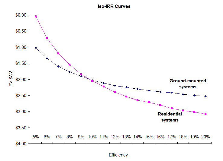
The constraints of the residential system make it less forgiving to the lower-efficiency modules. One way to look at it: in my previous ground-mounted example, a 10% module paid a penalty of $0.30/watt versus a 15% module. In a residential equivalent, the penalty grows to $0.67. In other words, residential projects are more willing to pay for higher efficiency, as a way of minimizing the more expensive labor/racking, and covering the larger fixed costs.
So, ground-mounted systems value cheaper price over good efficiency, and residential systems are more willing to pay more for high efficiency.
As a final step, let’s overlay the market prices of current technologies. Again, a big caveat: all of these numbers are very rough, and prices will always change quickly. These are just directional values.
| Technology | Efficiency | Cost ($/watt) |
| Amorphous silicon | 7% | $1.50 |
| Cadmium telluride | 10% | $1.75 |
| Poly-crystalline | 15% | $2.50 |
| Mono-crystalline | 18% | $3.25 |
Plotting these values on our graph, you can see the cost-performance horizon:
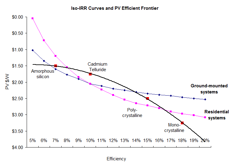 Theoretically, customers are always looking for something that is up and to the right on this graph (high efficiency and low cost). A ground-mount (large scale) customer is looking to optimize a curve that is shaped like the blue graph – and so you can see they will be more interested in using thin-film technologies. On the other hand, a residential customer, optimizing the pink curve, will be more interested in going with crystalline.
Finally: I’ve posted this model (you should see it on the box.net sidebar, “PV IRR Model II”). Feel free to download and play with it. Let me know what you think.
Note on the precision of the numbers*: The numbers here are only for directional takeaways. I have not gotten exact quotes on anything, and I am dramatically simplifying the cost model. I am accounting for only six line items (the largest ones), while a real system will have hundreds of components. Also, the fact that the curves cross at 10% efficiency is not relevant. 10% is not a magical number – in fact as I was fine-tuning the assumptions, I tried to keep the 10% efficiency & $2.05 point at the same IRR. But the real takeaway is that these curves will cross somewhere, wherever that point is.

1 comment